
Prague, Czech Republic
Brand Identity · Positioning · Copy · Design & Build
The brief
A studio that changed what it makes.
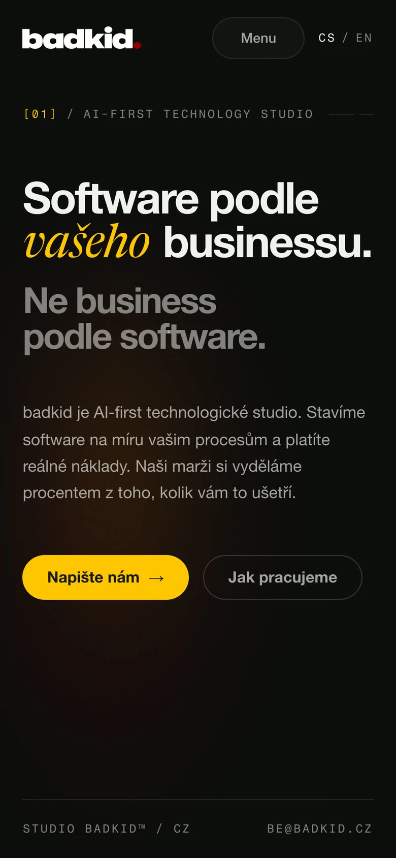
badkid started out selling design. It is now an AI-first technology studio, building custom software for companies that have outgrown the boxed solution they started with. The new identity and the new site were not cosmetics. They were the first two things that had to carry the new claim, or drop it.
My role
- Brand identityThe logomark, the wordmark, the colour canon, the type and the tone of voice.
- PositioningWhat the studio claims, and where that claim sits on the page.
- CopyEvery word on the site, in Czech and in English.
- Design and buildThe site itself, from the first layout to the deployed thing.
badkid is a studio I helped start, so this is work from the inside. The software the studio builds for its clients comes from its senior specialists, not from me. My side of it is how the studio looks, reads and shows up online.
Where it started
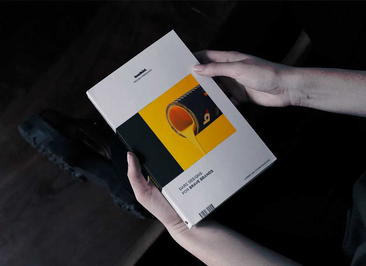
It began in print.
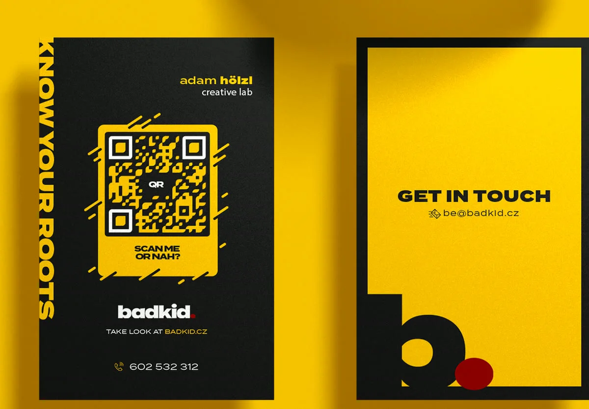
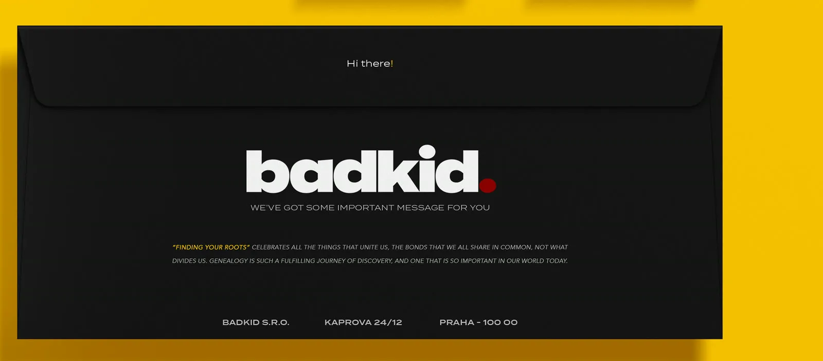
Before any of it was software, badkid sold design to brands that wanted to be noticed. Dare designs for brave brands, printed and posted. The work was physical, and it was loud.
Building the identity
A stem, a belly, a full stop.
The mark is a lowercase b that stops. Everything in it is cut from the same square grid, and the only warmth in the whole system is that dot: one oxblood accident in a canon of yellow and near-black.
Visual language
The site does not decorate. It lights.
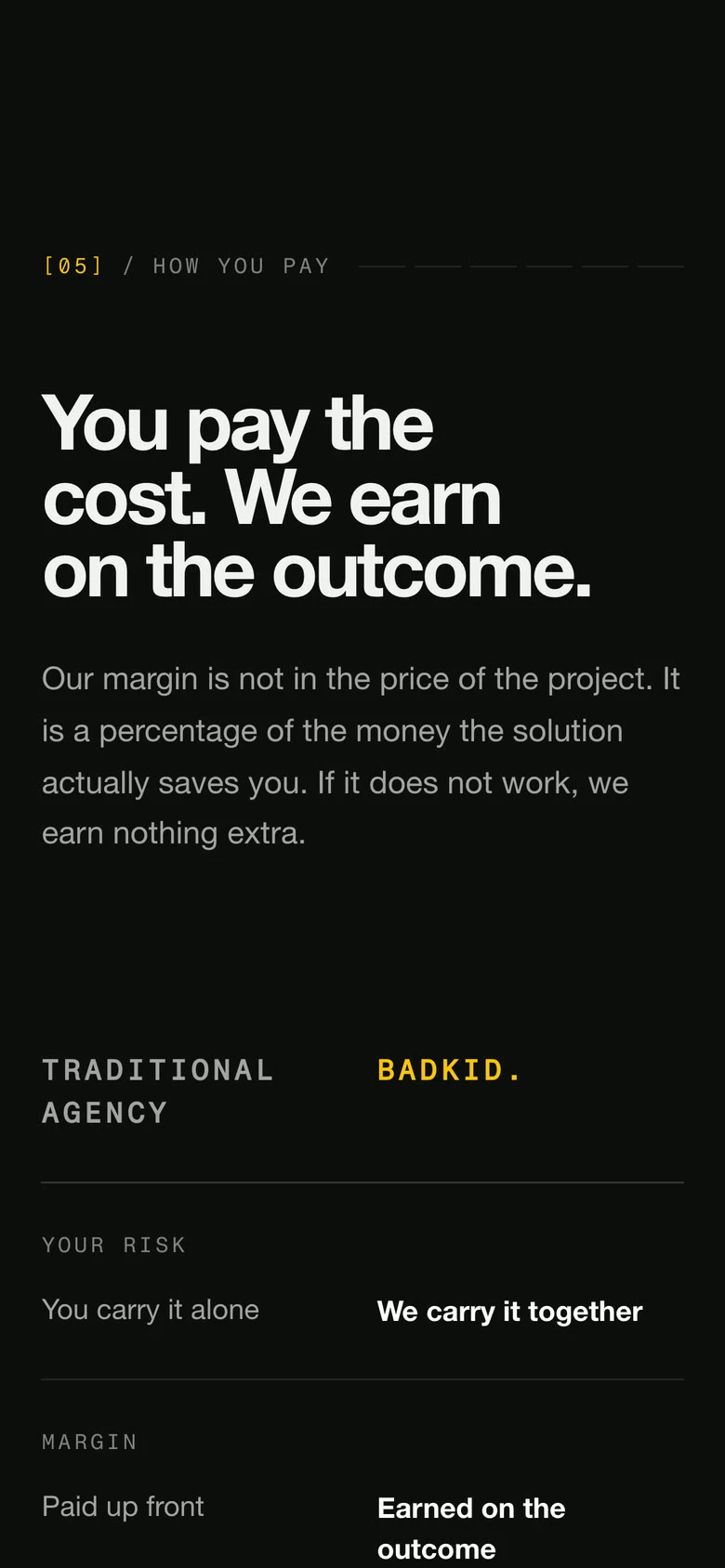
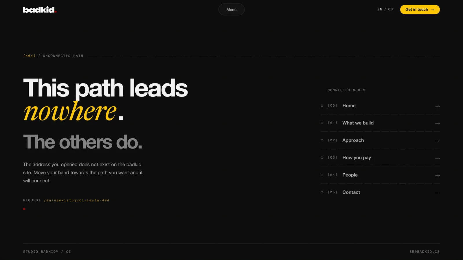
The whole interface is one idea: a technical drawing that is already there, revealed by light. Nodes sit on a thirty pixel grid, connections are only ever square, and the paper appears only where the hand is.
-
Light is the only actor. Things do not move. They get lit.
-
The structure is orthogonal, and it is already there. Light reveals it. It never draws it.
-
Attention wakes, calm sleeps. Nothing glows for longer than someone is there to see it.
What we removed
The best decision was a deletion.
A 3D hero was built, and the sparks and the orbit around it. All of it worked, and all of it went. The JavaScript fell from 124.5 kB to 2.4 kB. Today the homepage carries 8.6 kB of it in two languages, and no framework ever reaches the browser.
A studio that sells software keeps a site the size of one photograph.
--dur-touch:  0.18s;
--dur-settle: 0.45s;
--dur-decay: 1s;Selected details
Reflection
The studio changed what it sells. The identity never had to change what it is.
A brand built around a service dies with that service. This one was built as a way of seeing, so it survived the studio becoming something else entirely. Nothing works alone: the mark, the words and the code are the same argument made three times.
© 2026 Adam Hölzl. All rights reserved. · Lab · Privacy · Imprint