Construction & Solar, Czech Republic
Brand Identity Refresh · Logo System · Print & Templates · Social & Outdoor
The brief
The business grew faster than its face.
TRS Green builds, roofs and powers homes across the Czech Republic. By the time we met, the company had outgrown the identity it started with: every quote, card and post spoke a slightly different language. The assignment was not a new look. It was one voice for a company that already had plenty to say.
My role
- Brand identityThe mark refined, the system defined: one green, one black, and the rules that keep them straight.
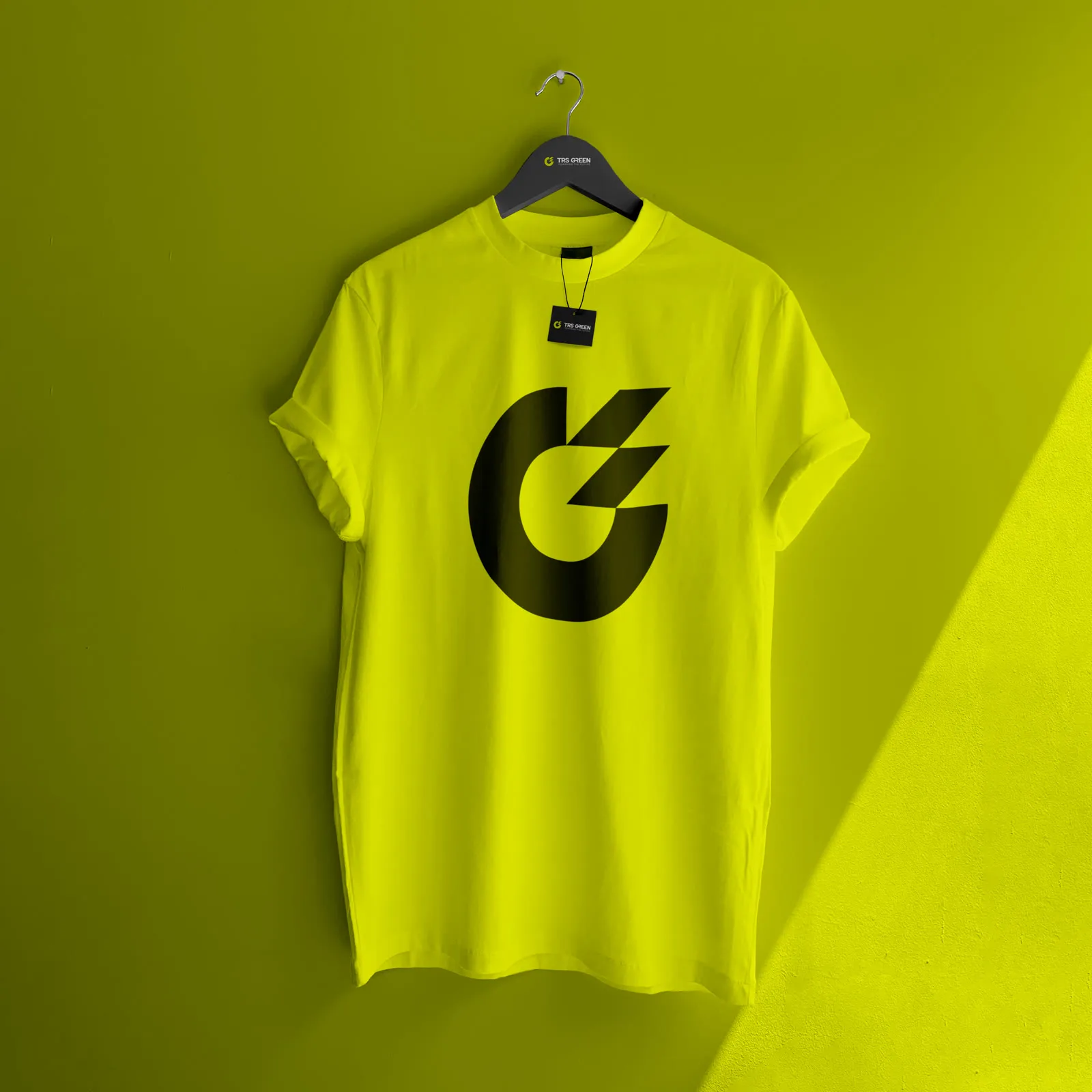
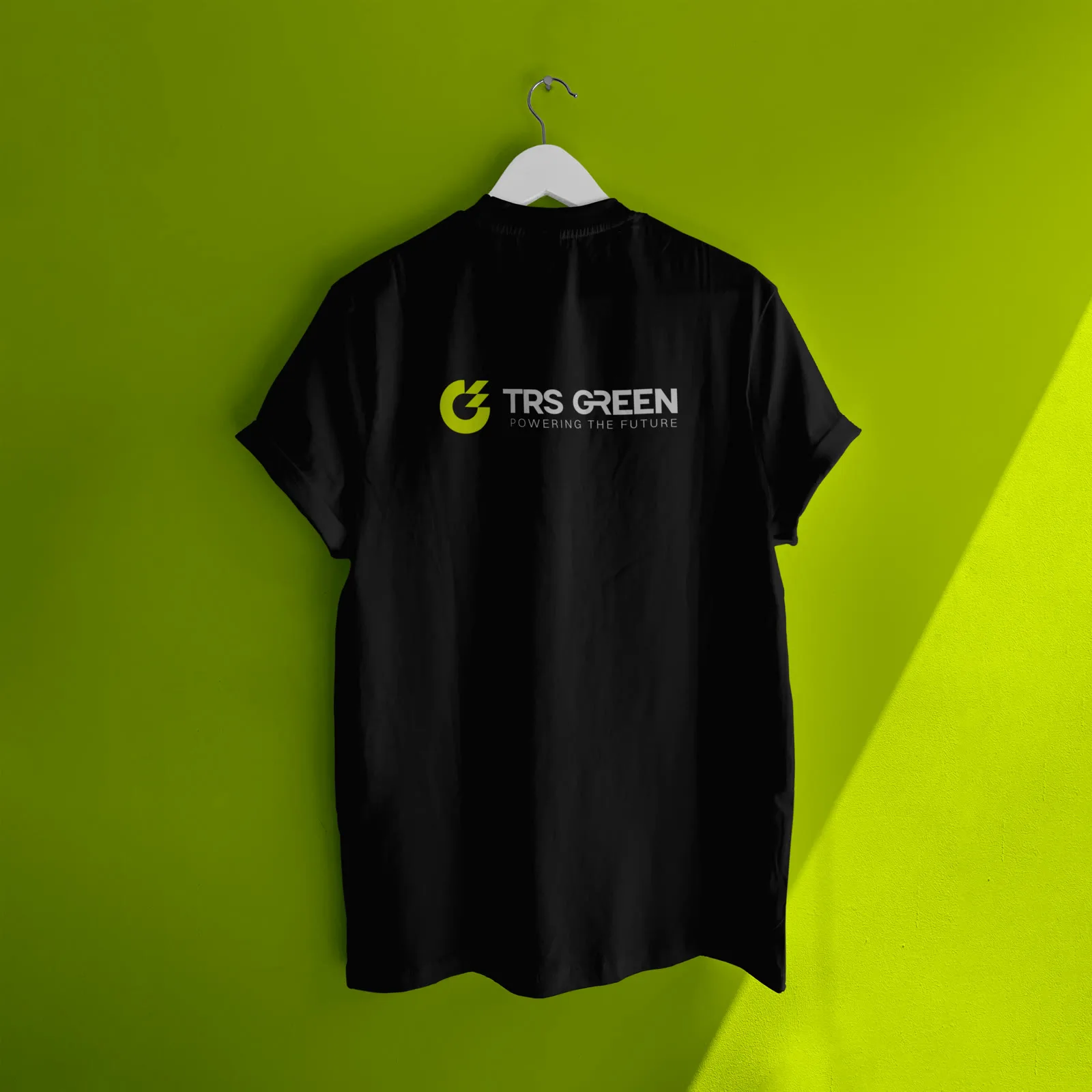
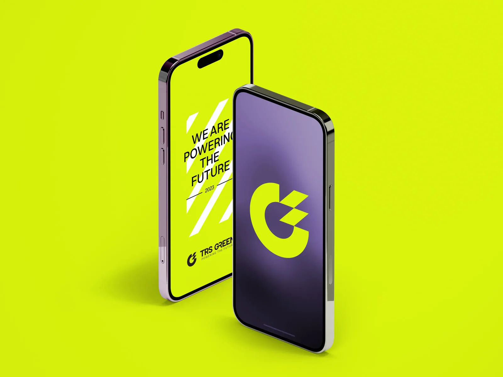
- Logo systemOne mark that works on an invoice, a helmet and a feed.
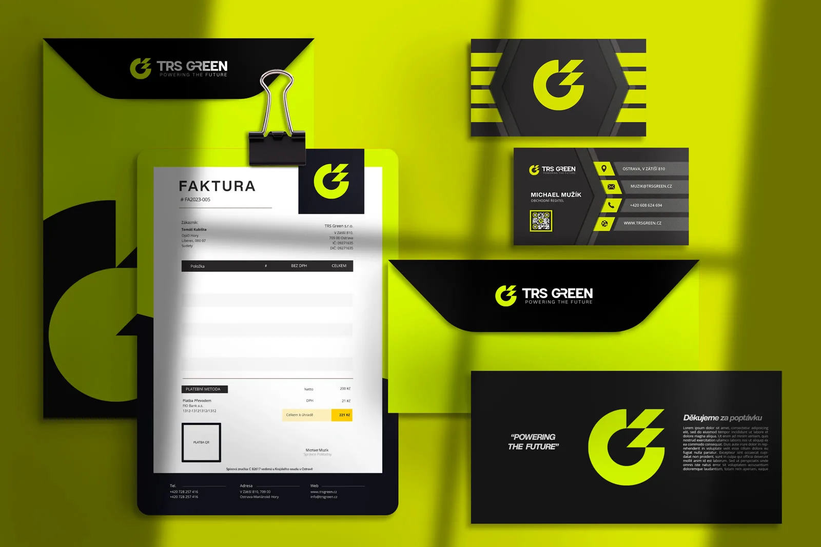
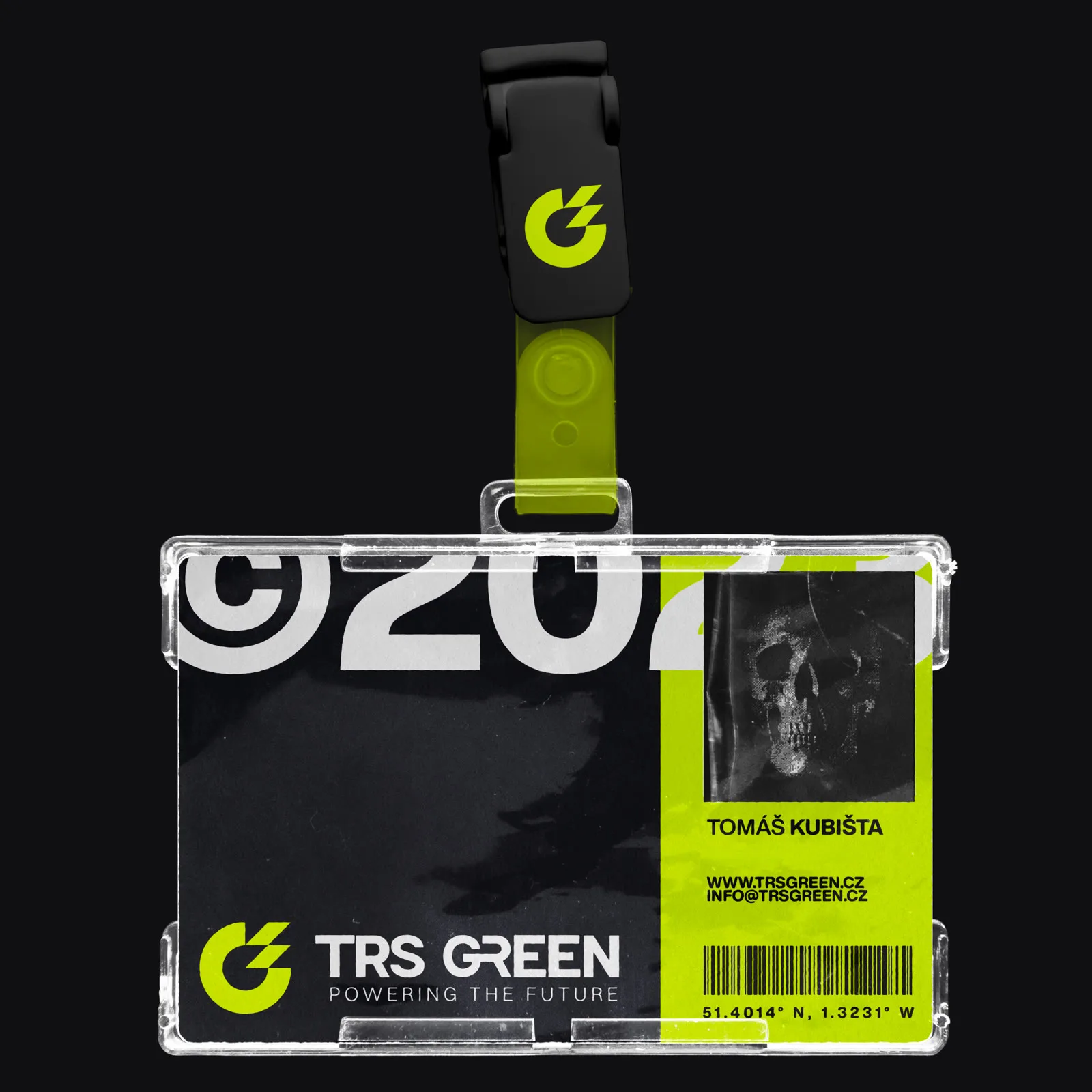
- Print and templatesBusiness cards, letterheads, contracts, presentations. The paperwork became the brand.
- Social and outdoorFeed templates and billboard concepts cut from the same cloth.
All of it was delivered in under three months. The current website came later, from other hands, built on top of this system.
Building the system
Consistency is the deliverable.
The mark needed refinement, not revolution: a G with a bolt of energy cut through it, sharpened until it holds at every size. The real work was everything around it. One green, one black, one grid, and templates strict enough that the brand cannot drift even when nobody is watching.
Visual language
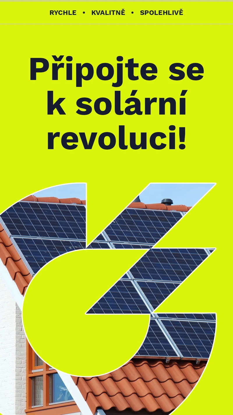
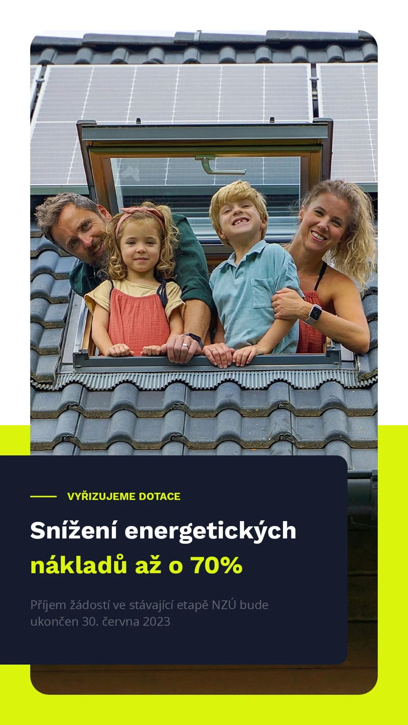
Every touchpoint, one voice.
A beautiful logo is easy to admire and easy to lose. This system was designed for the places a construction company actually lives: workwear, paperwork, and a feed read between job sites.
Identity in motion
A mark with energy cut through it ought to move. The animation assembles the logo from raw current and closes with the company's promise, ready for any screen the brand meets.
Selected details
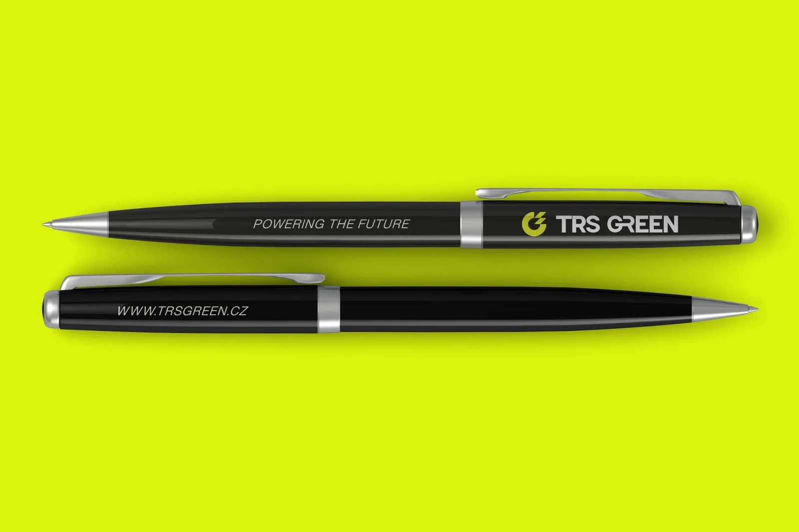
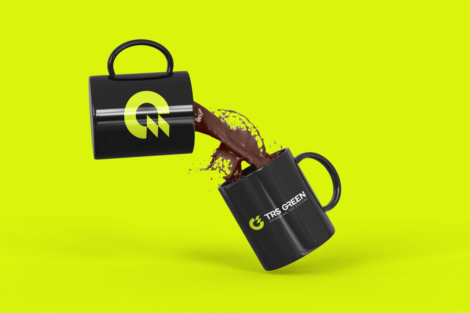
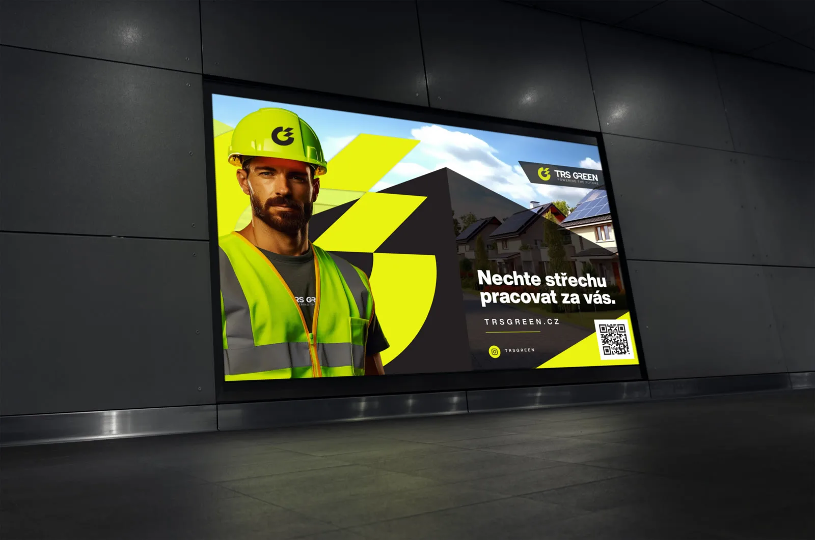
Reflection
Good branding is not one beautiful logo. It is every interaction feeling like it came from the same hands.
Years on, the identity still runs exactly as delivered. Longevity is the quietest metric a brand has, and the only one that cannot be faked. Nothing works alone; a mark only becomes a brand when the whole company wears it.
© 2026 Adam Hölzl. All rights reserved. · Lab · Privacy · Imprint